

Introduction
In my previous blog, I highlighted that while Business Analysts possess skills in handling data, their role extends far beyond deep data science and statistical modelling. Unlike Data Scientists, whose expertise lies in complex algorithms and predictive analytics, Business Analysts have broader business responsibilities, making strategic recommendations based on data-driven insights. This distinction does not diminish the significance of Data Scientists, as their contributions remain crucial in shaping advanced analytical solutions.
However, Business Analyst’s job role, even without formal training in data science, still requires uncovering meaningful patterns and trends within business data. Business Analysts often work with large datasets, but not all are familiar with technical knowledge about how to harness tools like Python and Jupyter Notebook to extract information from data. As a result, for data-driven analysis, they are primarily dependent on Data Scientists. Hence, understanding this technical knowledge can greatly enhance Business Analysts in their data analysis capabilities.
As a Business Analyst, I faced similar challenges some years back. So, I decided to crack the nut of data analysis using Jupyter Notebook with Python. In the process, whatever knowledge I gained, I thought I should share it in written form for fellow Business Analysts to gain. Hence, this blog serves as a practical guide for Business Analysts new to Python and Jupyter Notebook, walking through the easy and essential steps—from installation to hands-on data analysis commands—to empower them with the skills to leverage these tools effectively.
Embracing Jupyter Notebook with Python as a tool allows analysts to work with data interactively, something like you get what you ask for, making it easier to manipulate datasets, visualise trends, and conduct exploratory analysis without the need for deep coding expertise, which streamlines their analytical processes, improves efficiency, and extracts valuable insights that drive informed decision-making. By the end of this guide, you’ll have quite a solid foundation to start leveraging Python for data-driven decision-making.
Step 1: Installing Python
Before using Jupyter Notebook, the first step is to install Python—the programming language that powers Jupyter.
Downloading Python
- Visit the official Python website: https://www.python.org.
- Navigate to the “Downloads” section and select the latest stable version.
- Follow the installation instructions for your operating system (Windows/macOS/Linux).
- During installation, ensure you check the box that says “Add Python to PATH”—this simplifies running Python from the command line.
Verifying Installation
After Python installation, you may need to restart your computer as a one-time task. After reboot, open a command prompt (Windows) or terminal (macOS/Linux) and type the following command (shown in bold letters) to check if Python is installed correctly:
C:\Users\Dell>python
Python 3.13.3 (tags/v3.13.3:6280bb5, Apr 8 2025, 14:47:33) [MSC v.1943 64 bit (AMD64)] on win32 Type "help", "copyright", "credits" or "license" for more information.
>>>
Or just to check the version number of the installed Python, type the following command:
C:\Users\Dell>python --version
Python 3.13.3
Step 2: Installing Jupyter Notebook Using pip
Python comes with pip, which stands for package installer for Python. The term pip is also a package manager command used to install various libraries, including those for Jupyter Notebook.
Installing JupyterLab vs Jupyter Notebook
Jupyter comes with two types of interfaces – JupyterLab and Jupyter Notebook. JupyterLab an IDE (Integrated Development Environment) designed to be more extensive than Jupyter Notebook. JupyterLab offers a very interactive web interface that includes notebooks, consoles, terminals, CSV editors, markdown editors, interactive maps, and more. JupyterLab is used for workflows in data science, scientific computing, computational journalism, and machine learning (ML) procedures.
Whereas the small brother, Jupyter Notebook offers a standalone and simple web interface, using which analysts can access data files and perform essential tasks like data inspection, cleaning and transformation, data visualisation through various plots, and running machine learning algorithms on data. Jupyter Notebook is a very useful tool among the scientific community for documenting and sharing the step-by-step data analysis and computational process that sequentially keeps both the written commands and codes and their outcomes or results.
Now, it’s your personal choice based on your expertise whether you want to go with JupyterLab and use the notebook provided in it along with the other advanced features, or you want to go with the simplified Jupyter Notebook. I would suggest going with Jupyter Notebook first and exploring its capabilities before moving to the advanced tool JupyterLab.
To install JupyterLab, open a terminal or command prompt and type the following command:
C:\Users\Dell>pip install jupyterlabOr, to install Jupyter Notebook, type the following command:
C:\Users\Dell>pip install notebookThese simple commands will download and install the respective Jupyter tool along with all the required dependencies.
Launching JupyterLab and Jupyter Notebook
After installation, you can launch either JupyterLab or Jupyter Notebook by running the following respective commands:
C:\Users\Dell>jupyter labC:\Users\Dell>jupyter notebookThese commands will open the respective tool in your default web browser, providing an interactive environment to write and execute the Python code.
If you opened JupyterLab, select the default Python kernel in the popup box and go to the “File” menu and select “Notebook”, when the following notebook interface opens, where you can write the Python code and see the results.
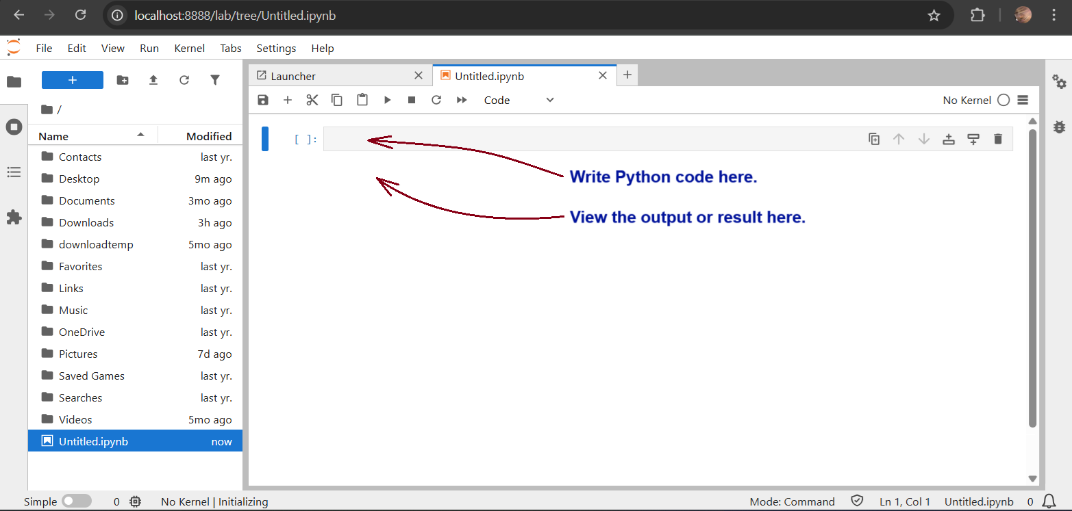
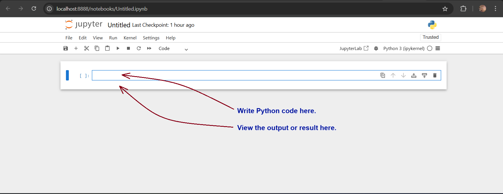
If you launched Jupyter Notebook, open the default “Untitled.ipynb” file and you will see the following interface, where you can write the Python code and see the results:
Exiting JupyterLab and Jupyter Notebook
To close JupyterLab properly, go to “File” menu and select “Shut Down” and confirm in the popup box. To close Jupyter Notebook properly, go to “File” menu and select “Shut Down” and confirm in the popup box. On closing the notebooks, you can return back to the terminal or command prompt.
Back in the terminal or command prompt, if you see a prompt to update the pip, type the following command:
C:\Users\Dell>python.exe -m pip install --upgrade pipStep 3: Useful Jupyter Notebook Commands for Data Analysis
Jupyter Notebook provides a flexible coding environment where Business Analysts can manipulate and analyse data efficiently. Let’s go over some fundamental commands and essential steps that are useful for business data analysis:
1. Importing Libraries
Python has powerful libraries for data analysis. Use the import command to add the required libraries. A list of some essential libraries can be found in this link. Let’s import some commonly used ones:
import pandas as pd
import numpy as np
import matplotlib.pyplot as plt
These libraries help in handling datasets, performing numerical calculations, and visualising data.
2. Loading a Dataset
Business Analysts often work with datasets. Here’s how you can load data from a CSV file into a DataFrame using the Pandas library:
file = "/<file path>/data.csv"
df = pd.read_csv(file)

df.head()  # Displays the first five rows of the dataset by default
df.head(10)  # Displays the first ten rows of the dataset
This will provide a quick preview of the dataset for analysis.
3. Basic Data Exploration
To analyse business data, it’s crucial to understand its structure. Some useful commands include:
df.info()  # Provides metadata about the dataset
df.describe()  # Displays statistical summaries like mean, median, and standard deviation
df.columns  # Lists all column names in the dataset
4. Filtering and Sorting Data
You can filter data based on specific conditions:
filtered_data = df[df["Revenue"] > 50000]
sorted_data = df.sort_values(by="Profit", ascending=False)
These commands allow you to focus on high-value business data points for deeper insights.
5. Visualising Data
Data visualisation is crucial in business analysis. Let’s create a simple bar plot:
plt.figure(figsize=(10, 5))
plt.bar(df["Category"], df["Sales"])
plt.xlabel("Product Category")
plt.ylabel("Sales")
plt.title("Sales Distribution by Category")
plt.show()
This helps in understanding sales patterns across different product categories.
Some Practical Examples
This section shows some real quick examples for reference to understand the capabilities of Python in Data Science using Jupyter Notebook.
For these hands-on examples, I downloaded a sample sales dataset in the CSV format—sales_data_sample.csv—from the Kaggle website. I reviewed the dataset using the pandas library and plot with the matplotlib library. For this analysis, I first installed these libraries and used the following codes to get the respective outputs as shown in the associated images. You may recheck these codes at your end.
pip install pandas
pip install matplotlib

import pandas as pd

file = "/Users/Dell/Downloads/archive/sales_data_sample.csv"
mydata = pd.read_csv(file, encoding='unicode_escape')
mydata.head()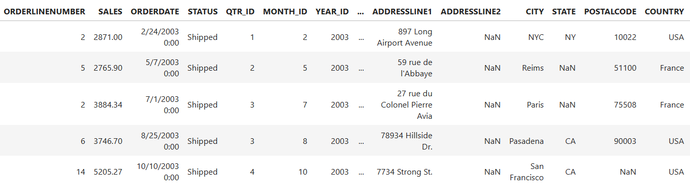
mydata.dtypes
mydata.describe()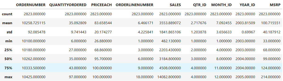
I then plot the above data description in a histogram that provides insights into the distribution of sales values in our dataset. I used the seaborn library along with matplotlib to plot the nice-looking histogram with a smooth density curve. You need to install the seaborn library using pip. The significance of the histogram is as follows:
- Understanding Data Distribution: It shows how sales values are spread across different ranges.
- Frequency Analysis: Each bar represents how many data points fall within a specific sales range.
- Detecting Skewness: Helps identify whether the sales data is normally distributed, right-skewed (more lower sales), or left-skewed (more higher sales).
- Finding Outliers: If certain bars are isolated far from others, they might indicate extreme values or anomalies.
- Decision-Making: Useful for evaluating trends, such as whether most sales are concentrated within a specific range or spread evenly.
pip install seaborn

import matplotlib.pyplot as plt
import seaborn as sns

# Create histogram
plt.figure(figsize=(10,5))
sns.histplot(mydata['SALES'], bins=20, kde=True, color='blue')

# Customize labels
plt.xlabel('Sales')
plt.ylabel('Frequency')
plt.title('Sales Distribution with Smoothed Density Curve')

plt.grid(axis='y')
plt.show()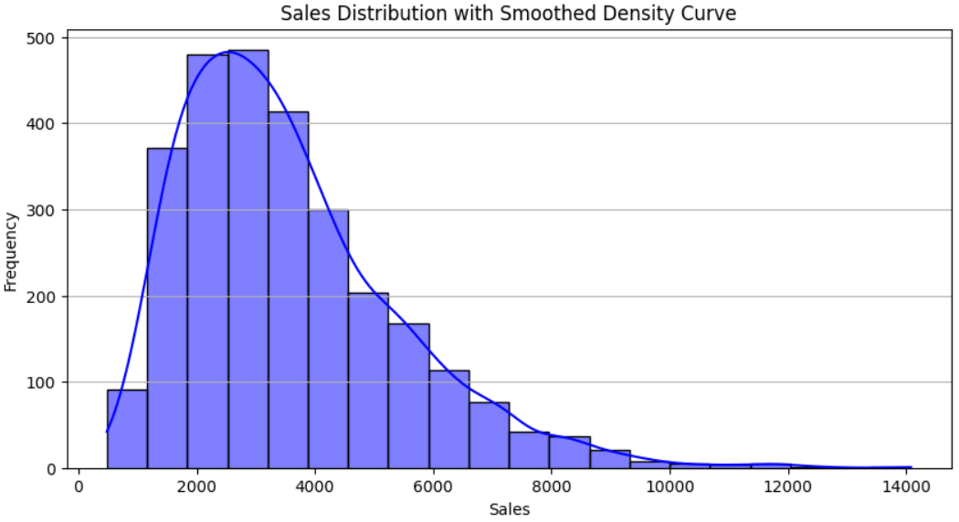
As you can see in the dataset, it has multiple SALES records for a COUNTRY. So, we need to combine all sales per country and group them in a new dataset in memory that will be used in all future analysis.
mydata.groupby(["COUNTRY"]).sum().sort_values("SALES", ascending=False)
Now let’s see the total sales per country in a simple bar graph plot using the matplotlib library.
import matplotlib.pyplot as plt

countries = mydata.COUNTRY
sales = mydata.SALES

# Set figure size before plotting
plt.figure(figsize=(10, 6))

plt.bar(countries, sales)

plt.xlabel('Country')
plt.ylabel('Total Sales')
plt.title('Sales by Country')
plt.xticks(rotation=45)
plt.grid(axis='y')
plt.tight_layout()

plt.show()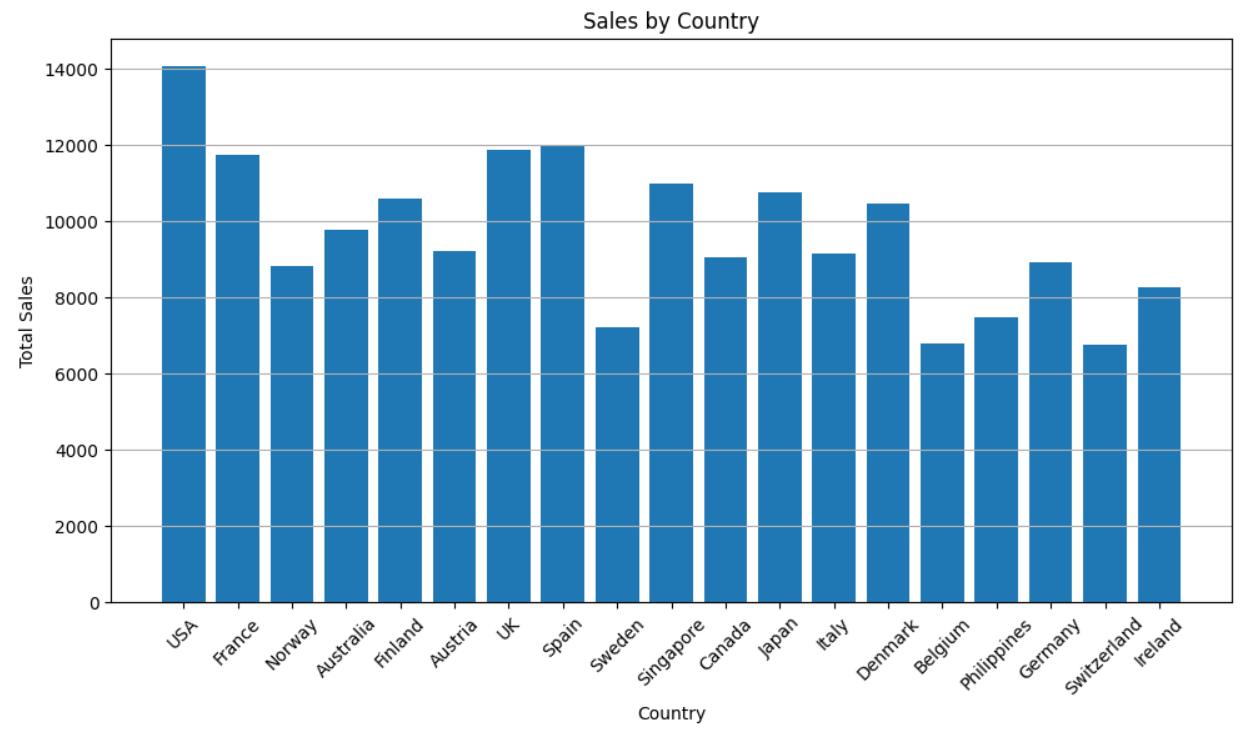
Now let’s plot maximum sales by country for each of the years in a bar chart.
import pandas as pd
import matplotlib.pyplot as plt

# Find the maximum sales by country and year
max_sales = mydata.groupby(['COUNTRY', 'YEAR_ID'])['SALES'].max().reset_index()

# Pivot the data for easier plotting
pivot_data = max_sales.pivot(index='YEAR_ID', columns='COUNTRY', values='SALES')

# Plot the bar chart
pivot_data.plot(kind='bar', figsize=(10,5), width=0.8)  # Default is 0.6, increase to 0.8

plt.xlabel('Year')
plt.ylabel('Max Sales')
plt.title('Maximum Sales by Country Each Year')
plt.legend(title='Country', bbox_to_anchor=(1,1))
plt.xticks(rotation=45)
plt.grid(axis='y')

plt.show()
Now, let’s plot the above plot in the form of a heat map using the seaborn library.
import seaborn as sns
import matplotlib.pyplot as plt

# Create a pivot table for heatmap
heatmap_data = max_sales.pivot(index='YEAR_ID', columns='COUNTRY', values='SALES')

# Plot the heatmap with improvements
plt.figure(figsize=(12,6))  # Increase figure size
sns.heatmap(heatmap_data,
            annot=True,
            fmt=".0f",  # Round values to whole numbers
            cmap="YlGnBu",  # Use a better colormap
            annot_kws={"size": 10},  # Reduce annotation text size
            linewidths=0.5,
            linecolor="gray",  # Add subtle gridlines
            cbar=False)  # Remove color bar for clarity

# Adjust labels
plt.xticks(rotation=45)  # Rotate country labels
plt.yticks(rotation=0)   # Keep year labels horizontal

plt.xlabel('Country')
plt.ylabel('Year')
plt.title('Max Sales Heatmap by Country and Year')

plt.show()
As seen in the dataset, each country sells various products identified by the Product Code. Let’s see the maximum sales for each unique Product Code in the country UK.
import pandas as pd
import matplotlib.pyplot as plt

# Filter data for UK
uk_data = mydata[mydata['COUNTRY'] == 'UK']

# Find maximum sales for each unique PRODUCTCODE in UK
max_sales_uk = uk_data.groupby('PRODUCTCODE')['SALES'].max().reset_index()

# Plot the bar chart
plt.figure(figsize=(20,8))
plt.bar(max_sales_uk['PRODUCTCODE'], max_sales_uk['SALES'], color='skyblue')

plt.xlabel('Product Code')
plt.ylabel('Max Sales')
plt.title('Maximum Sales for Each Unique ProductCode in UK')
plt.xticks(rotation=90)
plt.grid(axis='y')

plt.show()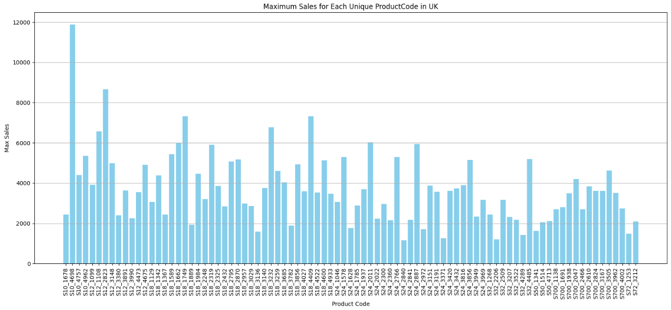
Also, let’s see the total sales of a specific product with Product Code, say S18_3232, compared across different countries in a particular year, say 2004.
import pandas as pd
import matplotlib.pyplot as plt

# Filter data for product "S18_3232" and year 2004
product_data = mydata[(mydata['PRODUCTCODE'] == 'S18_3232') & (mydata['YEAR_ID'] == 2004)]

# Aggregate total sales for each country
sales_by_country = product_data.groupby('COUNTRY')['SALES'].sum().reset_index()

# Sort by country for better visualization
sales_by_country = sales_by_country.sort_values(by='SALES', ascending=False)

# Plot line chart
plt.figure(figsize=(12,6))
plt.plot(sales_by_country['COUNTRY'], sales_by_country['SALES'], marker='o', linestyle='-', color='blue')

plt.xlabel('Country')
plt.ylabel('Total Sales')
plt.title('Total Sales of Product S18_3232 Across Countries (Year 2004)')
plt.xticks(rotation=45)
plt.grid()

plt.show()
That’s all in this blog. These are just a few examples of various possibilities using Python. You may try similar analysis with other datasets.
Conclusion
With Python and Jupyter Notebook, Business Analysts can efficiently handle, analyse, and visualise data without requiring deep programming knowledge. This guide provided a strong starting point, covering installation, basic operations, and essential commands for business data analysis that are essential and mostly used. As you become more familiar with Python, you can explore more advanced coding techniques to optimise your workflow and make data-driven decisions with confidence.